

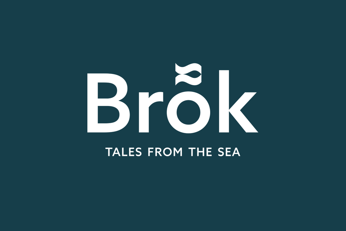
Brõk - Tales from the sea
Brõk is a brand of ready to eat fish products that will tickle your senses and delight your taste buds, which required an integrated system of visual and verbal identity.
The name Brõk is a regionalism of the word brak denoting a sunken reef, a gathering and hatching place for fish. A place where it all begins. In today’s world virtually always on the verge of panic and racing for time, one sometimes needs to reach out for forgotten simplicity. Regardless of the fact that oftentimes we have no time to cook and plan particular meals and delicacies, it does not mean we cannot afford them, with minimum preparation time.
Simple visual identity is based around the diacritic mark above the letter O, duplicated and flipped horizontally to resemble a fish icon. It's used in the packaging background, color coded for different products and UV varnished. The fish icon can also be applied as a pattern.
Client: Orada Adriatic Ltd.
Agency: Manasteriotti DS
Art Direction and Design: Igor Manasteriotti
Naming and strategy: Jelena Babić


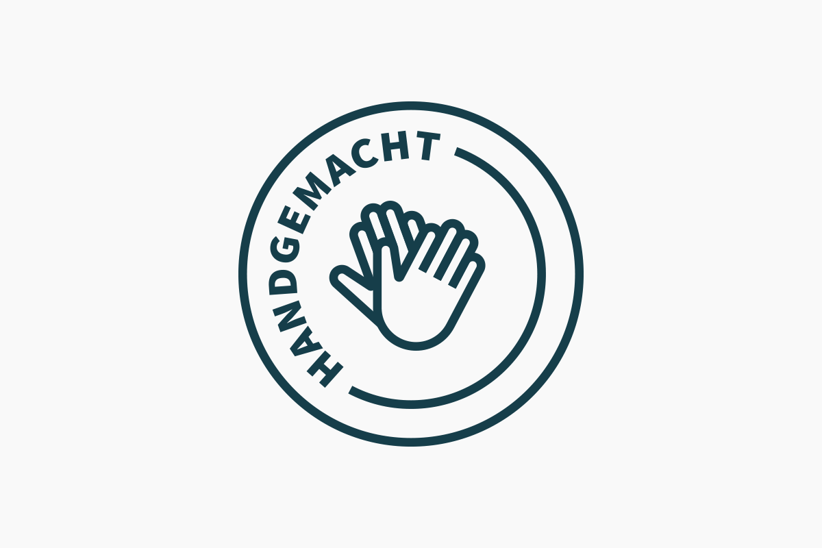
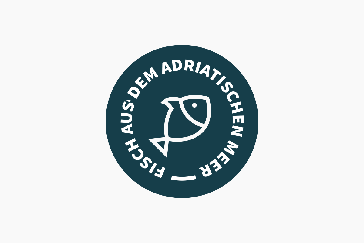
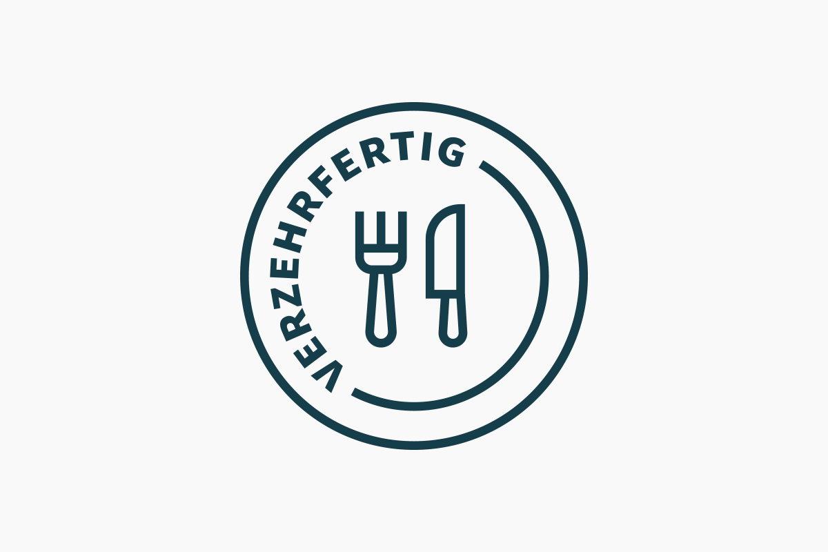
Product line (German version)

Back label


Simple attachment to container


Product images
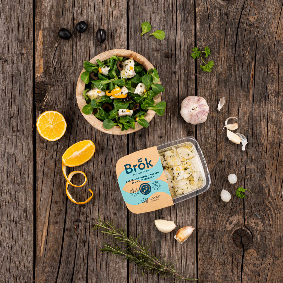
Photo by Domagoj Kunić

Photo by Domagoj Kunić

Photo by Domagoj Kunić
Do you need help with your branding project? Click here to get in touch.
Copyright ©2023 Manasteriotti DS
Please do not reproduce any material on this site without written permission.